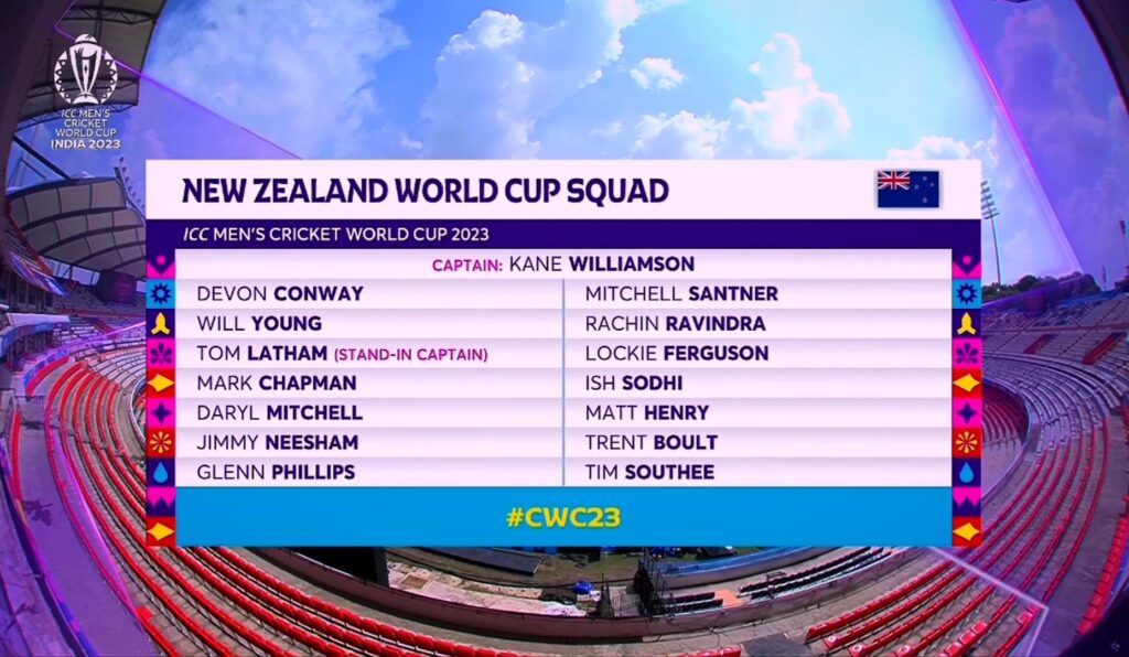
Finally, the long wait is over – the 2023 Cricket World Cup has just begun! Cricket fans, like me, were eagerly waiting to see the new scorecard graphics for the tournament. Finally, the ICC revealed them during the first warm-up match between Pakistan and New Zealand.
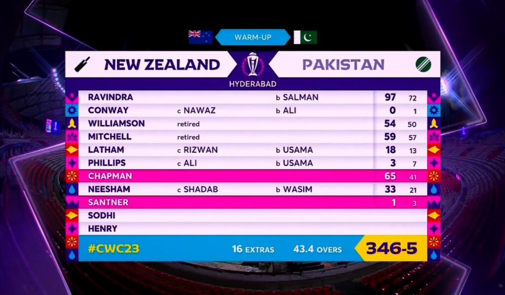
The graphics look clean and easy to read, kind of like a mix of the 2017 Champions Trophy and 2019 cricket world cup. They kept similar colors and added some new ones, like violet and pink in fonts and overlays. In addition to this, they included symbols like chakras, showing off a bit of Indian culture since the tournament is being held there.
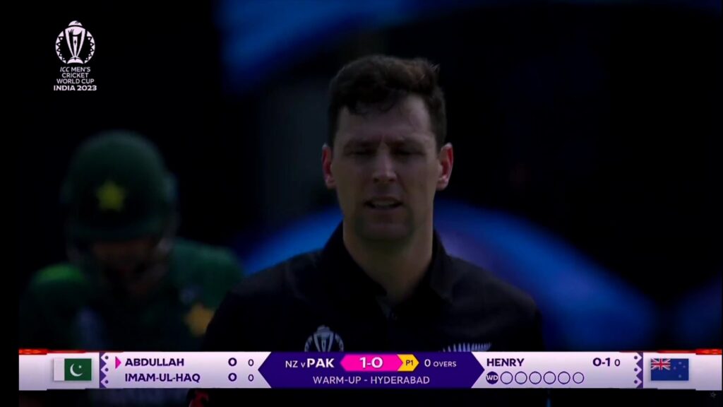
But there’s a downside – the player profile graphics aren’t that great. No player images and the available information is not enough. Also, the violet color makes it less pleasing to the eyes. The design of the borders does not look appealing to the viewers either. The combination of sharp white edges and violet finishing make the borders look less appealing to me.
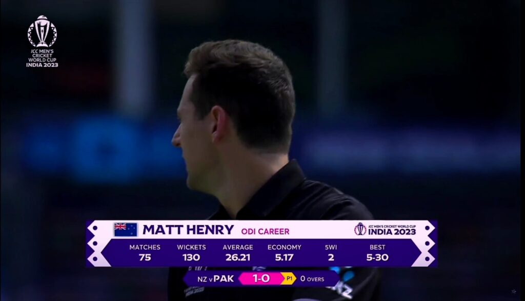
To make the player profiles better, they could add pictures and give more info. to the views.
That being said, the best thing about these scorecard graphics is their seamless and great transition from one set of graphics to another. They have used the best available animations to make the transitions effortless.
